The client sought a distinctive brand identity that communicates its artisanal craftsmanship and holistic healing philosophy while appealing to modern lifestyle consumers. The visual direction needed to harmonize spiritual warmth and refined aesthetics across packaging, digital presence, and marketing materials.


Before starting the design, I conducted multi-layered research to build a strong foundation for the brand’s identity.
1. Market & Competitor Study
I analyzed over a dozen handmade candle and wellness brands in Taiwan and abroad.
Through this, I noticed two dominant trends:
2. Target Audience Understanding
I observed customer behavior on social media (#手作蠟燭 #healingcandles #水晶蠟燭) and reviewed user feedback from small candle boutiques.
Most buyers were young professionals seeking emotional healing and mindfulness through sensory experiences like scent and light.
They valued authenticity, handcrafted quality, and a brand story that felt calm, healing, and personal.
3. Visual Mood Exploration
I built a moodboard inspired by moonlight, celestial orbits, and crystal reflections, combining natural and cosmic elements.
From this, I extracted three main visual principles:

The brand’s visual identity combines celestial symbols with natural textures to communicate handcrafted elegance and cosmic serenity.
Logo Concept
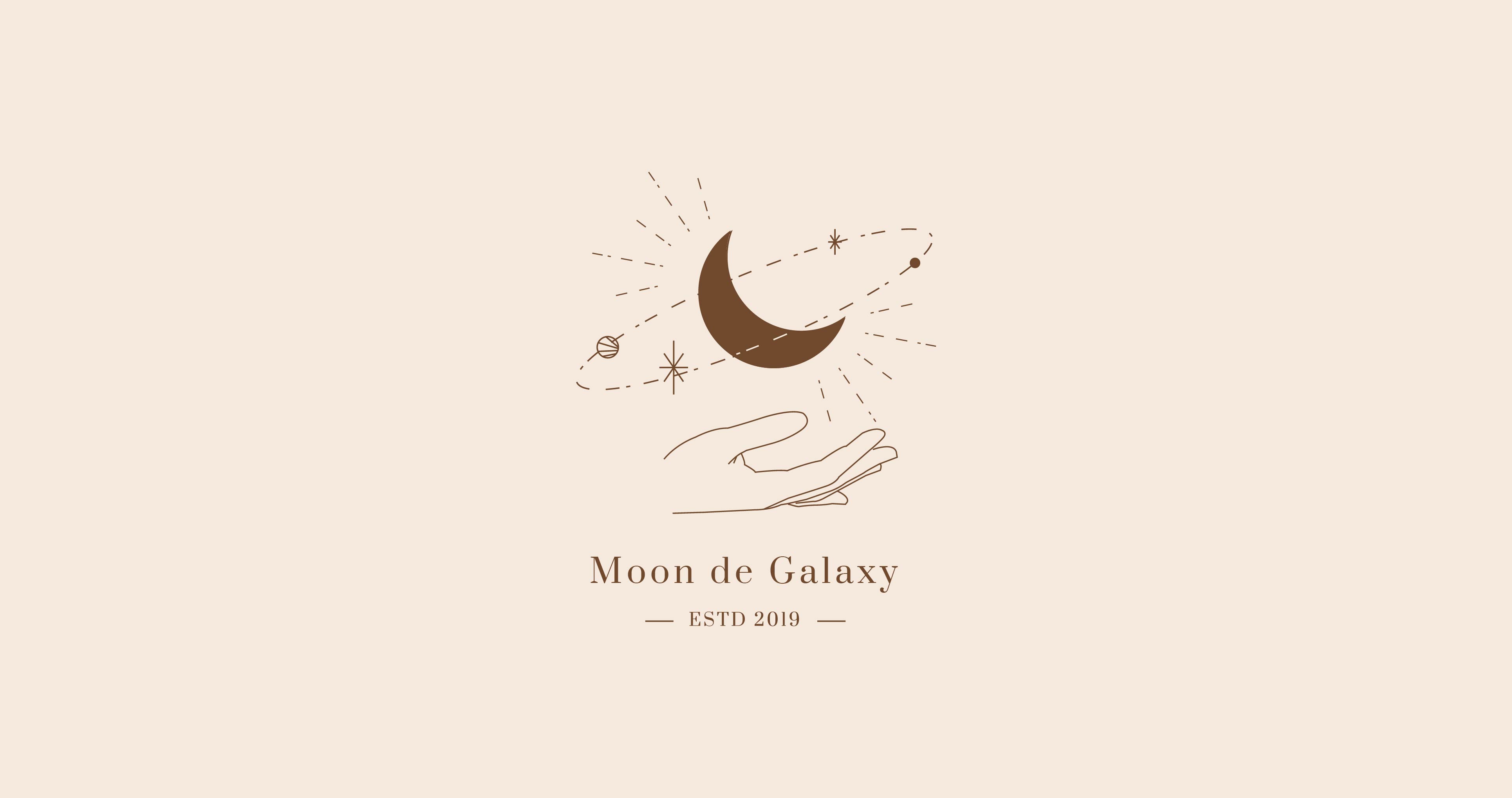
The logo features a hand cradling a crescent moon, symbolizing the harmony between human touch and universal energy. Orbit lines and stars represent balance, light, and healing guidance.
Typography
I selected Prata Regular for its elegant, serif structure that conveys sophistication while maintaining softness. The tall forms and subtle curves add a timeless and graceful tone suitable for a lifestyle brand.
Color Palette
The palette draws from natural and cosmic elements —
Packaging was designed to feel like an invitation to a personal ritual.


The final identity establishes Moon de Galaxy as a premium yet soulful brand, expressing calmness, healing, and celestial elegance across every touchpoint.
Reflection:
This project taught me how to translate emotional concepts into visual form, balancing elegance with meaning. It strengthened my belief that thoughtful, research-driven design can create genuine emotional resonance.
Let’s create something amazing together! Whether you're looking for a designer to bring your vision to life or want to collaborate on a project, I’d love to hear from you. Drop me a message, and let’s make it happen!