inefi

Developed a cohesive brand identity for inefi, including logo design, style guide, marketing materials, and UI elements, to align with its mission of simplifying IT management.
My role: UI Designer, Graphic Designer
Tools: Figma, Illustrator, Photoshop
Project Introduction

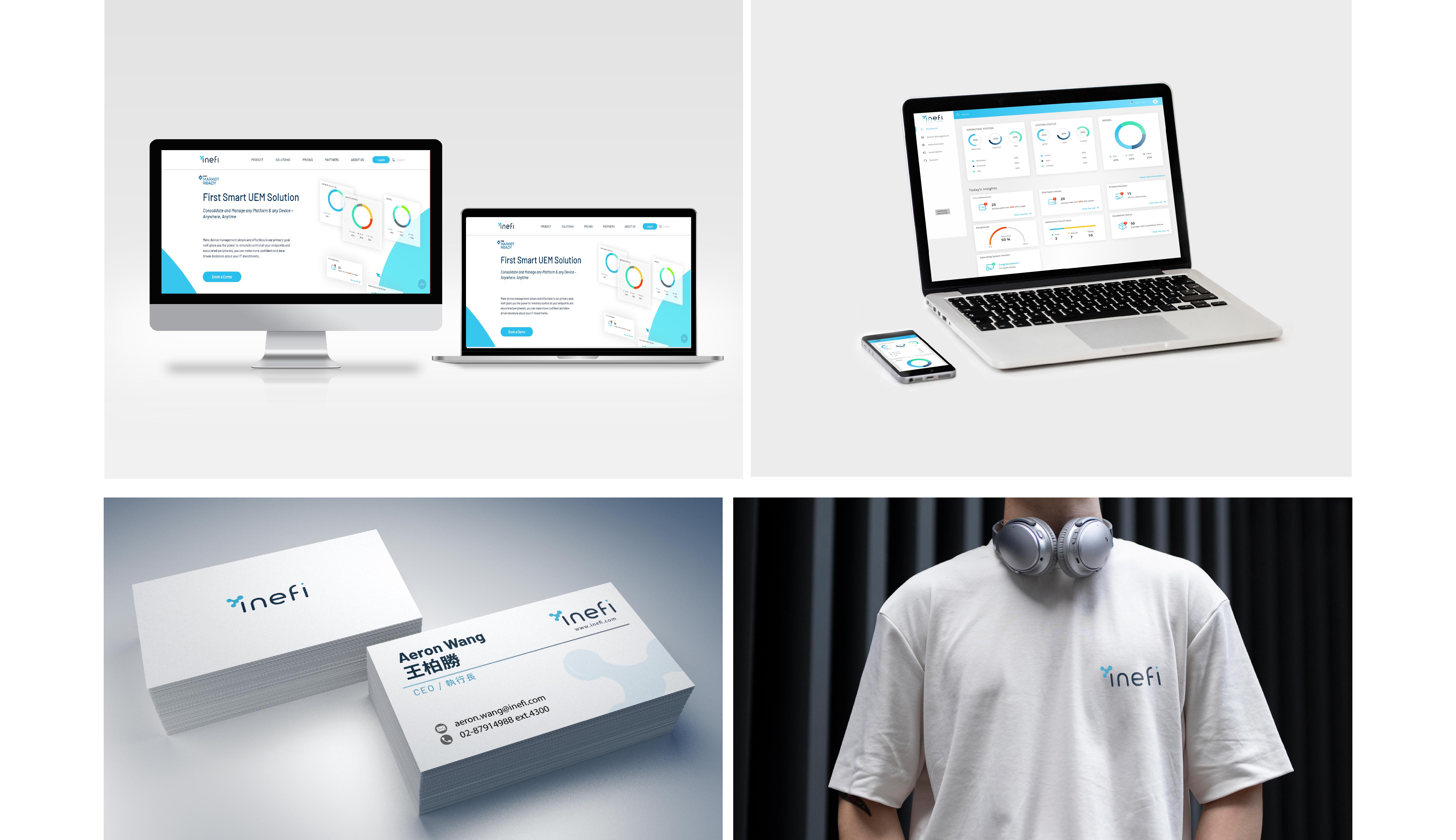
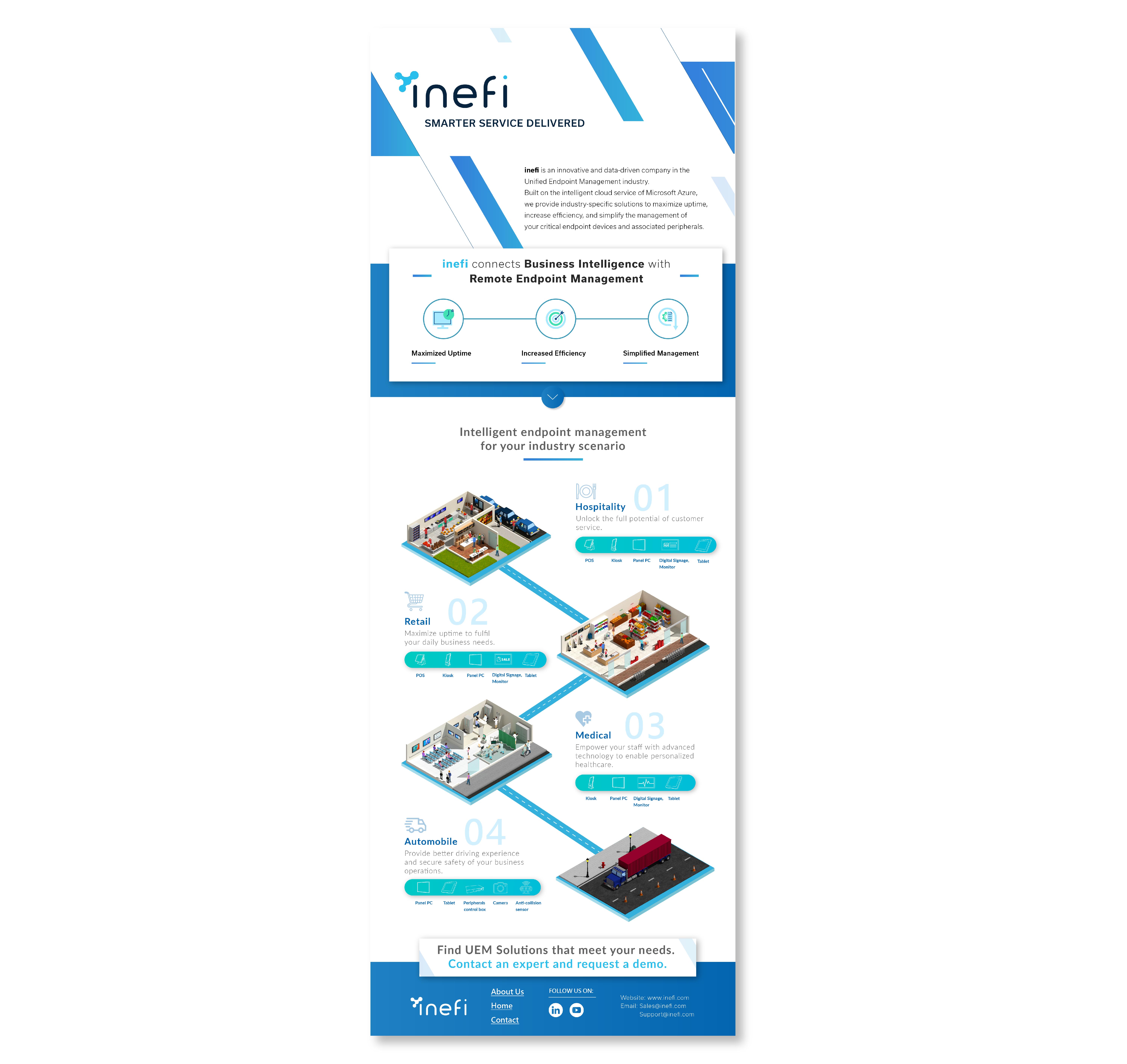
Inefi offers a centralized endpoint management (UEM) platform that helps businesses stay safe and connected. My design goal was to translate these robust features into a clear, user-centric interface—ensuring key functionalities like remote control, device lockdown, and streamlined deployments are presented in a modern, approachable way.

No items found.
The Challenge

Striking the right balance between an innovative, tech-forward look and an approachable brand presence was essential. A futuristic aesthetic could intimidate less tech-savvy users, while a more conservative style might underplay Inefi’s modern, transformative solutions.

How I Solved It
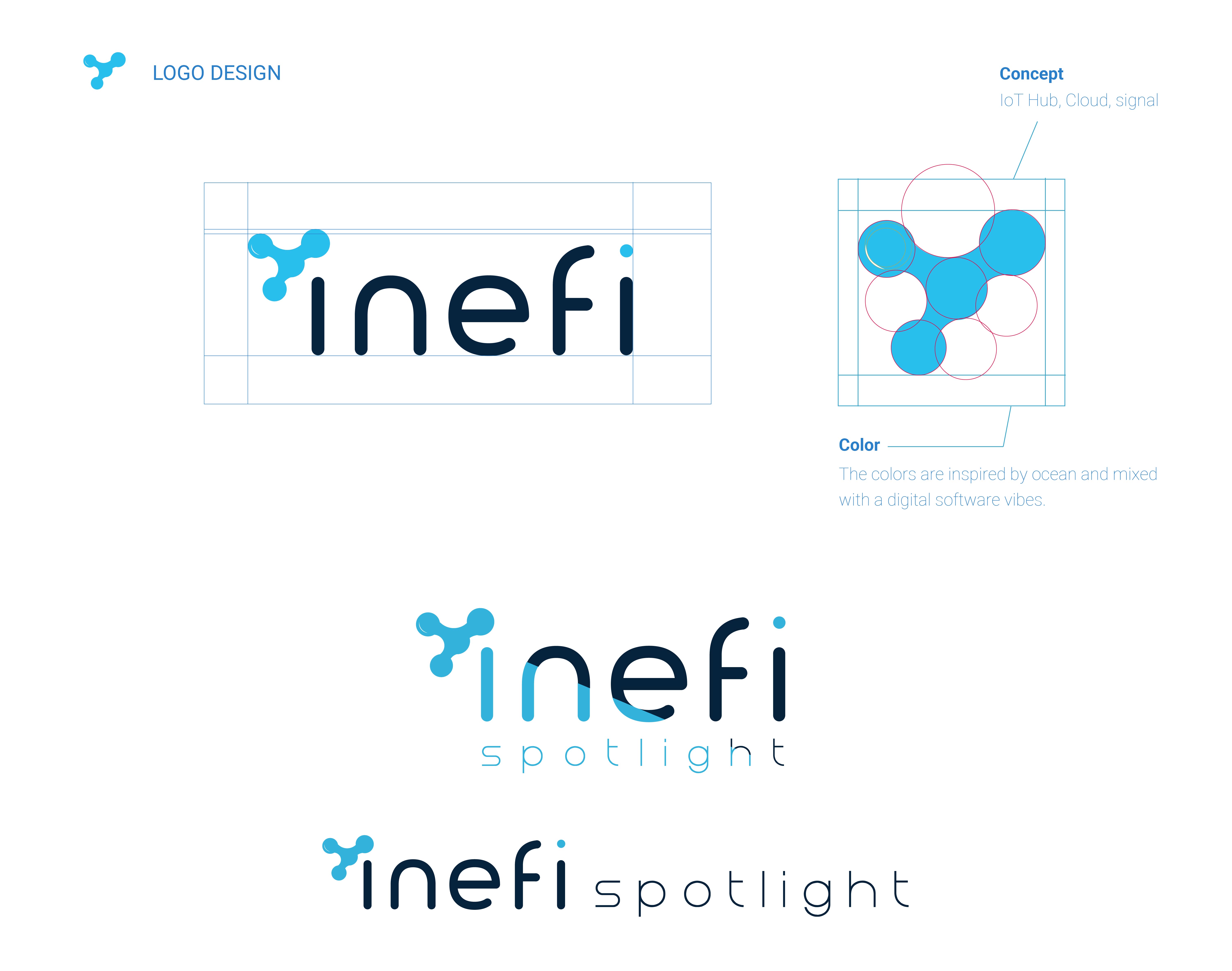
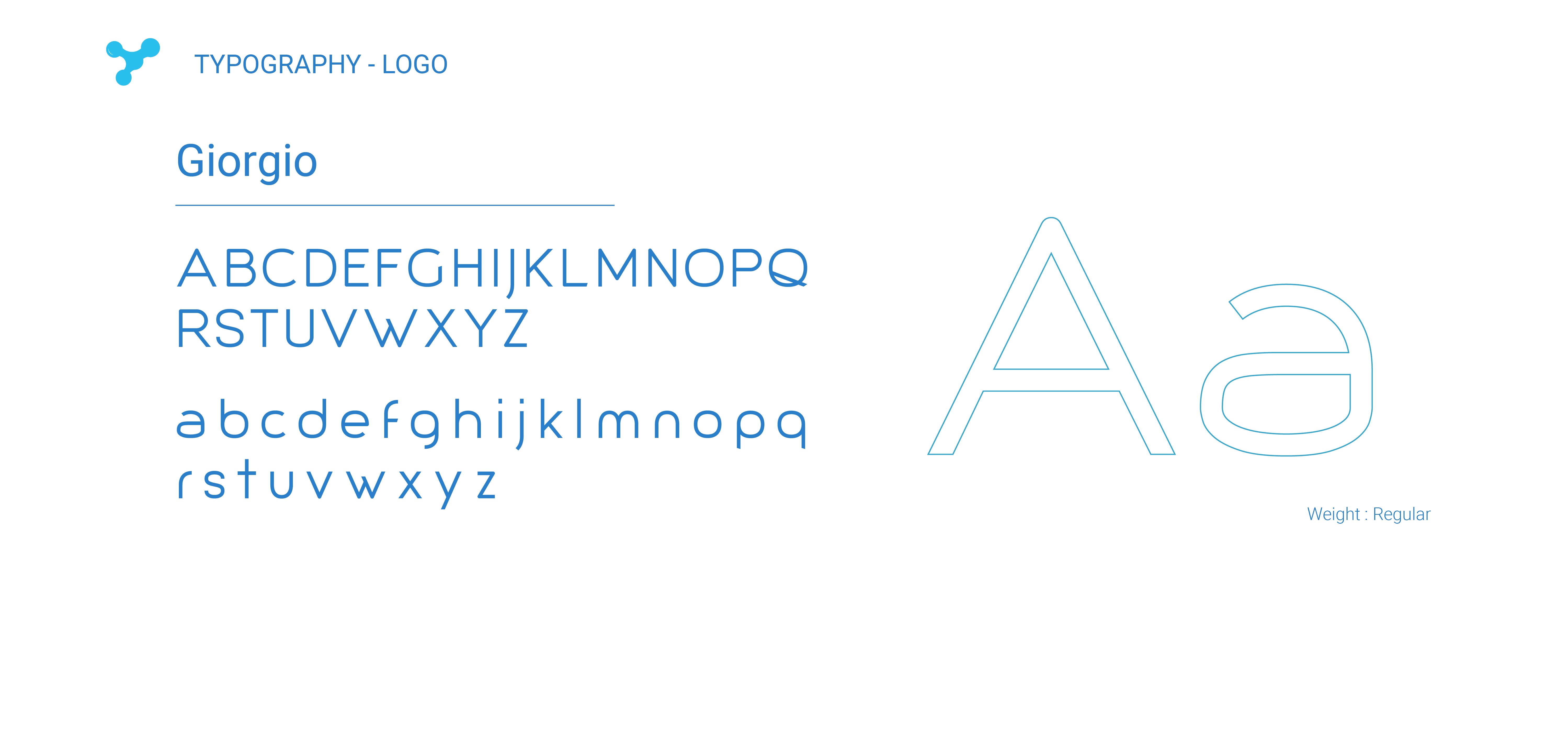
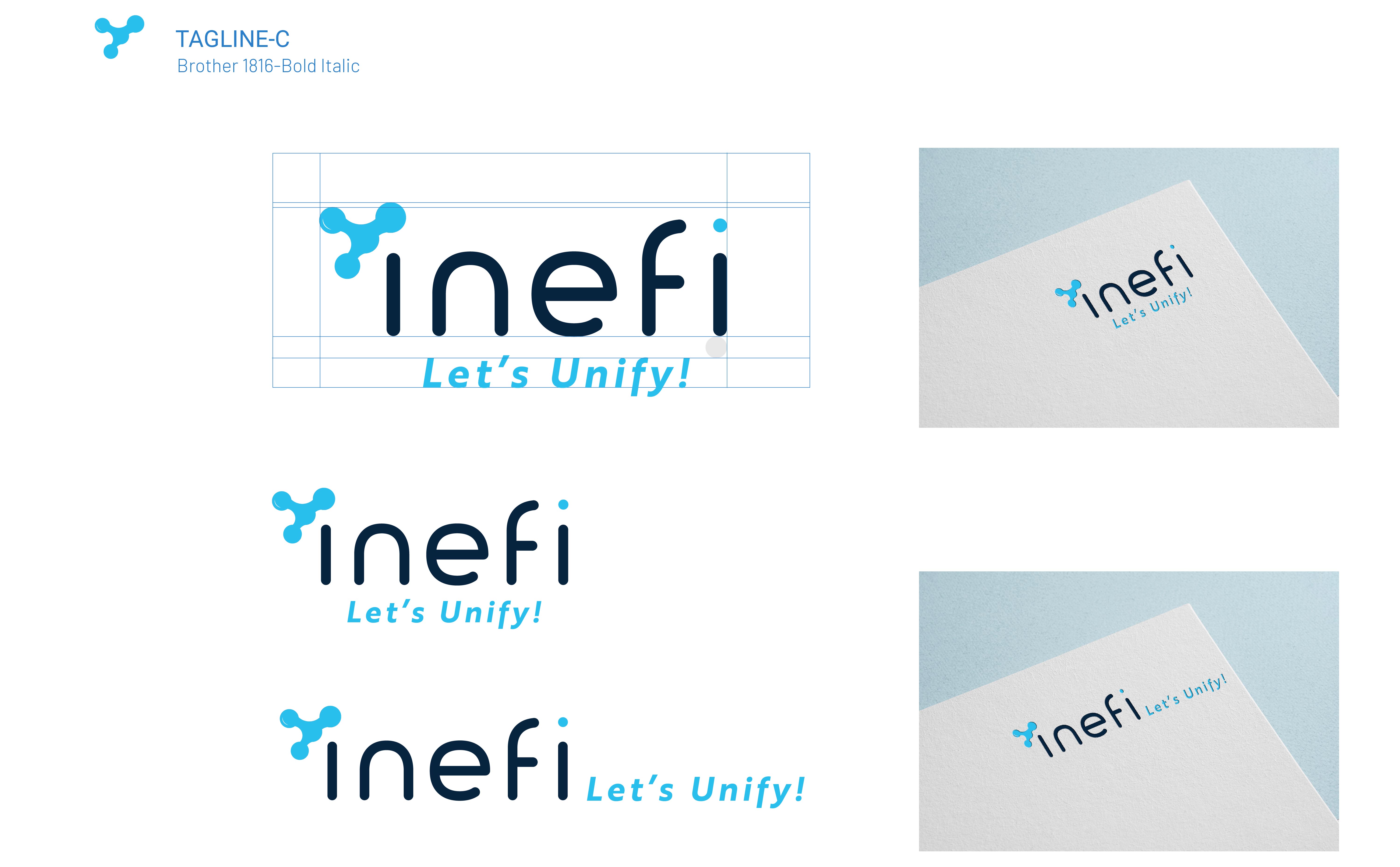
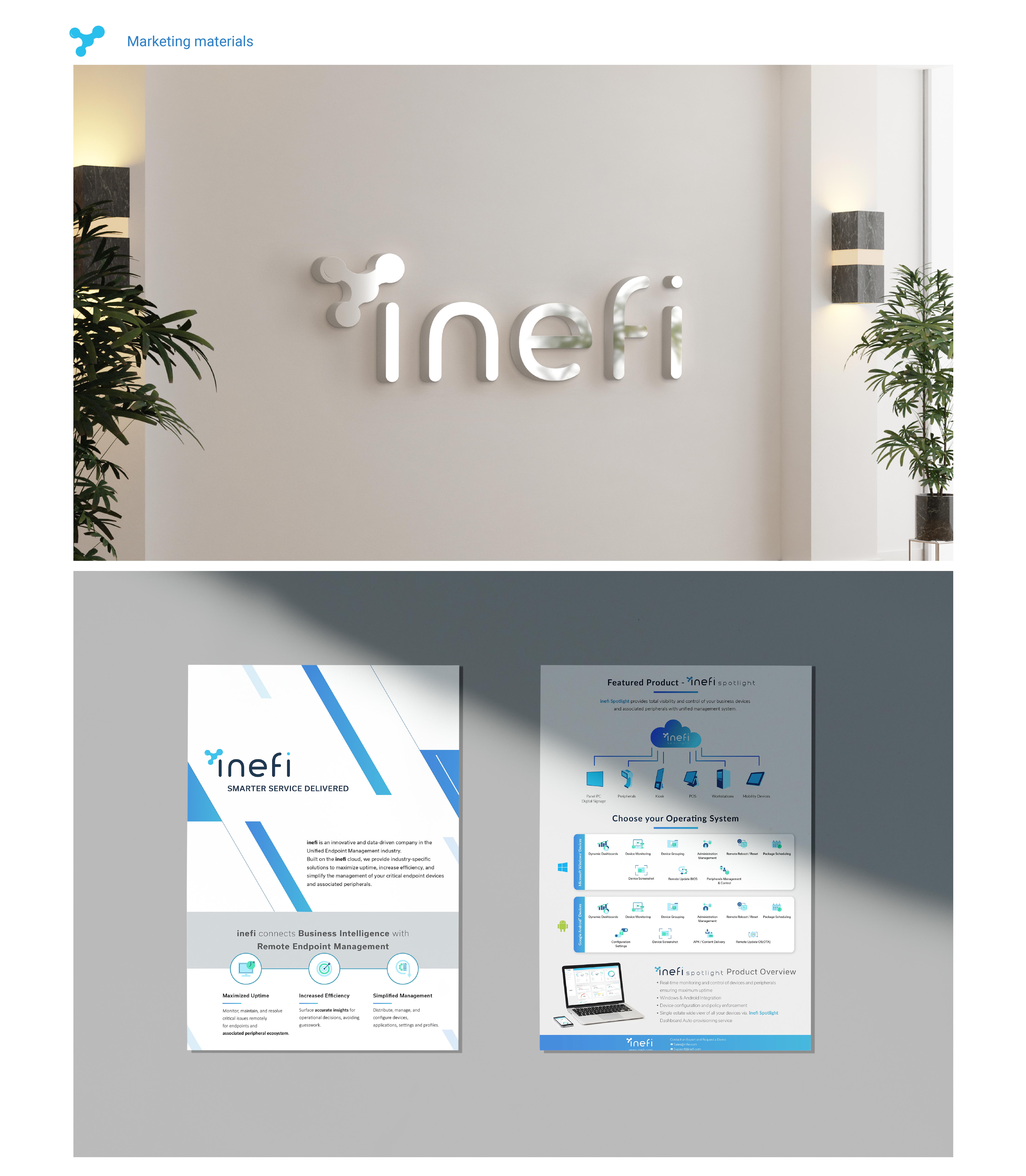
I developed a sleek, minimal brand system that pairs contemporary typography with a refined color palette, reinforcing innovation without sacrificing warmth. This cohesive design language—applied consistently across logos, icons, and marketing materials—conveys Inefi’s advanced capabilities while remaining inviting. The result is a brand identity that promises both technological prowess and user-friendly accessibility, ensuring Inefi’s uniqueness resonates with a wide range of stakeholders.

Design Concept & Approach
  • Brand Positioning & Visual Language
    Grounded in modern minimalism and clarity, the brand’s visual identity conveys Inefi’s focus on innovation, trustworthiness, and ease of use. Clean typography and a refined color palette guide visitors toward the platform’s key capabilities—such as peripheral oversight, remote control, and locking down devices in kiosk mode.
  • UEM Solution Emphasis
    To reflect Inefi’s unified endpoint management approach, the design places each core functionality—Manage Deployments, Remote Control, and Lockdown Devices—front and center. Using straightforward iconography and succinct copy, each section illustrates how the platform reduces complexity and facilitates business continuity.
  • Clear Hierarchy & Navigation
    A structured layout ensures quick access to crucial information. Strategic headings, consistent spacing, and concise calls to action allow different audiences (hospitality, retail, etc.) to find relevant solutions without feeling overwhelmed.
  • Highlighting Safety & Connectivity
    Visual cues and messaging underscore the theme of a safe, always-connected environment. This includes subtle design elements that reinforce the brand’s commitment to protecting device integrity, enabling teams to stay productive and minimize disruptions from out-of-the-box to in-use.
  • No items found.

    Let's work together !

    Let’s create something amazing together! Whether you're looking for a designer to bring your vision to life or want to collaborate on a project, I’d love to hear from you. Drop me a message, and let’s make it happen!

    Thank you! Your submission has been received!
    Oops! Something went wrong while submitting the form.