
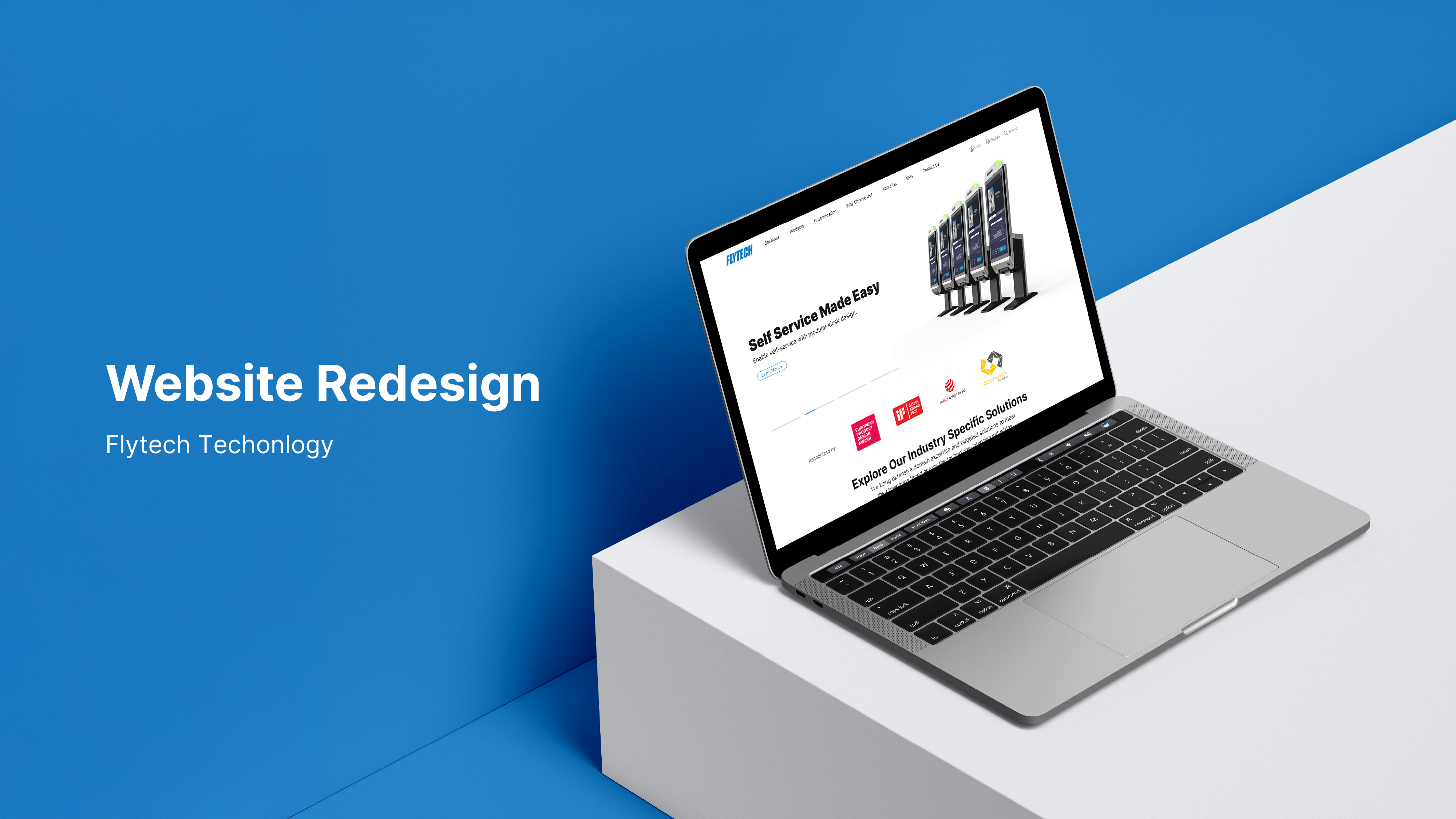
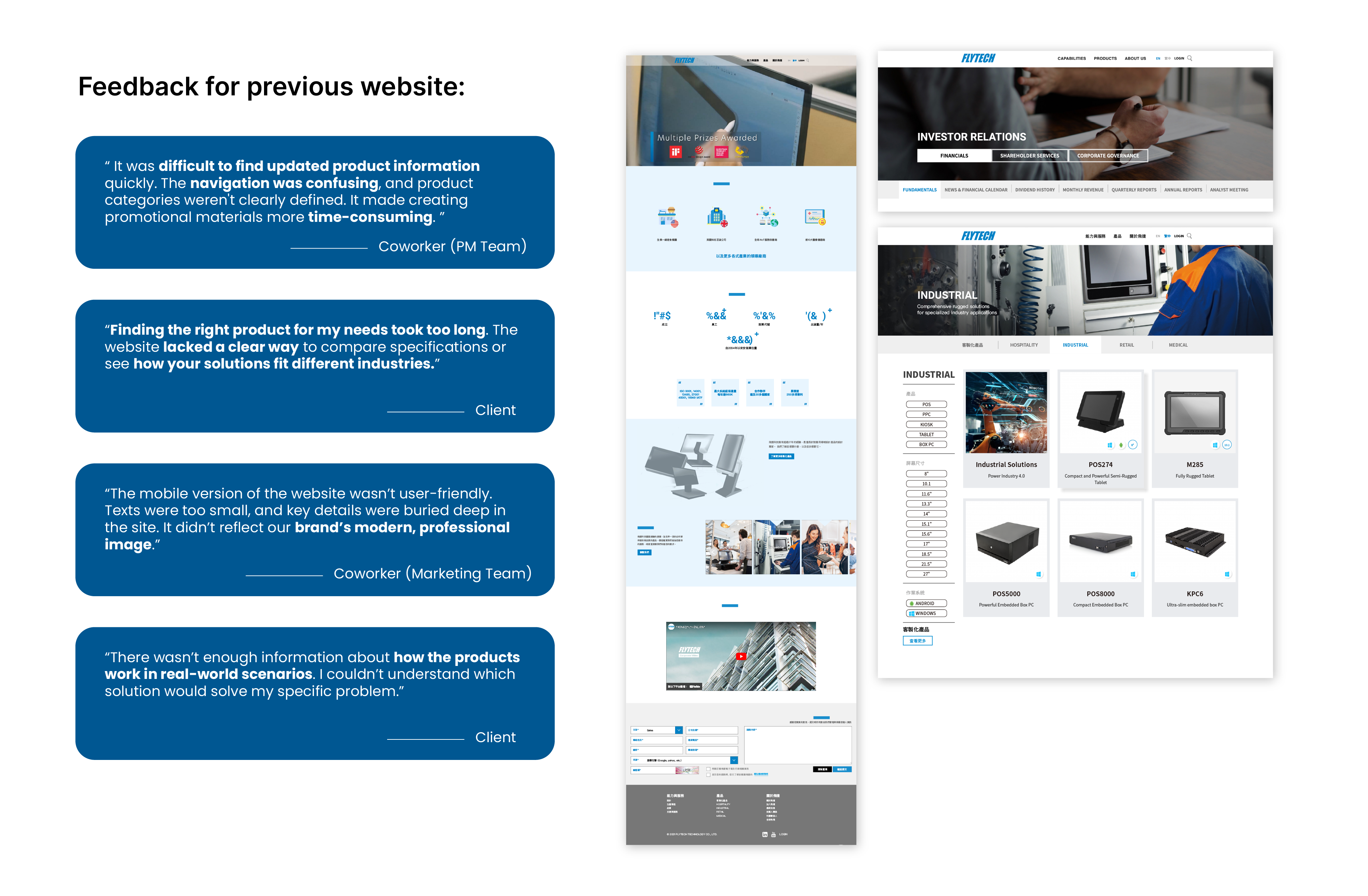
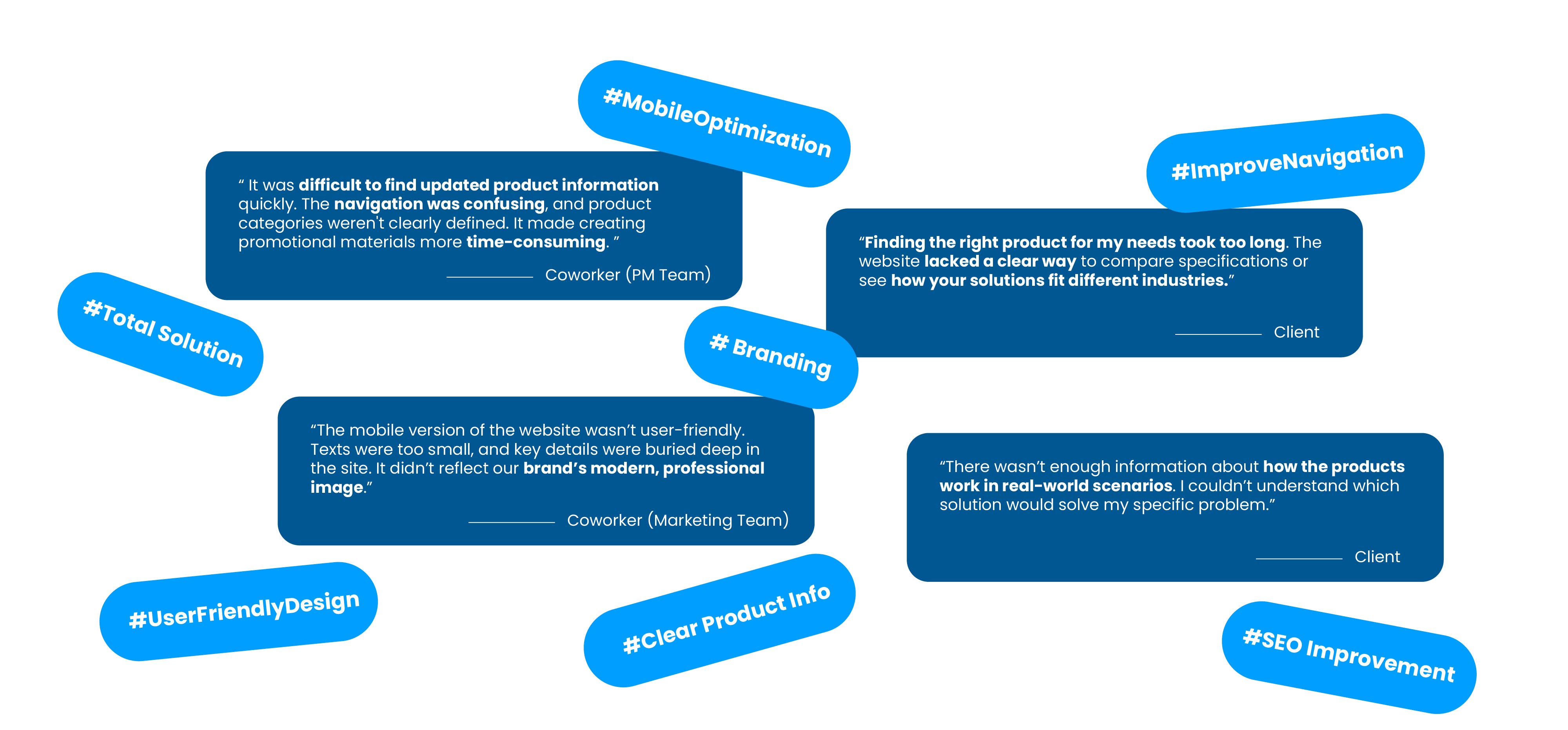
The original Flytech website had a cluttered structure, unclear product categories, and visuals that failed to represent the brand’s innovative identity, making navigation frustrating and the overall experience feel outdated.
Clients struggled to find essential resources like product brochures and data sheets, often leading to confusion and dropped inquiries.
The investor relations pages were dense and hard to follow, and the mobile experience lacked usability.
These issues weakened user trust, reduced engagement, and limited Flytech’s ability to communicate its value effectively.
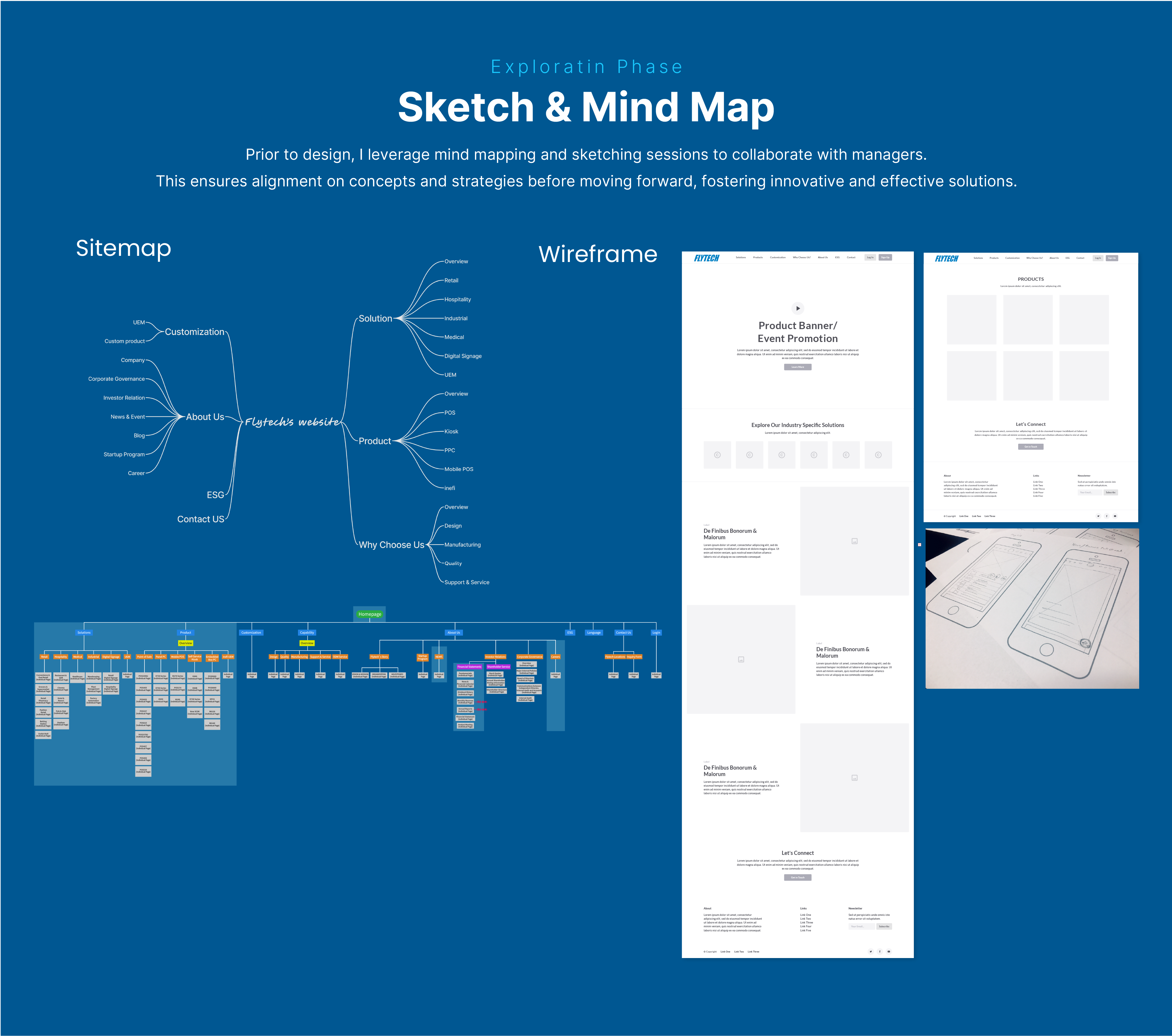
To design a solution grounded in real user needs, I led a discovery process involving:
These insights guided every design decision and helped define a more intuitive site structure.
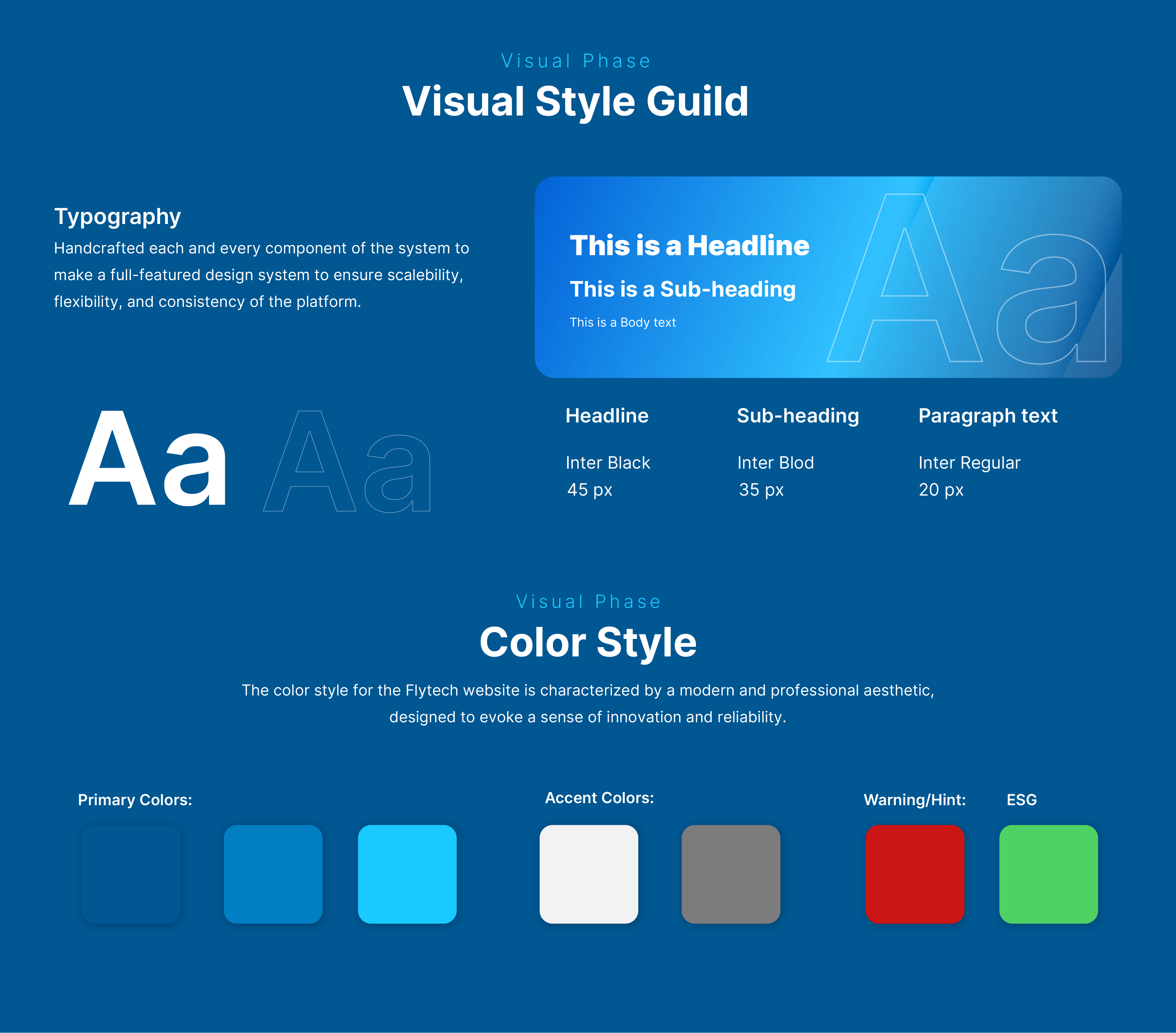
The design direction focused on three principles:
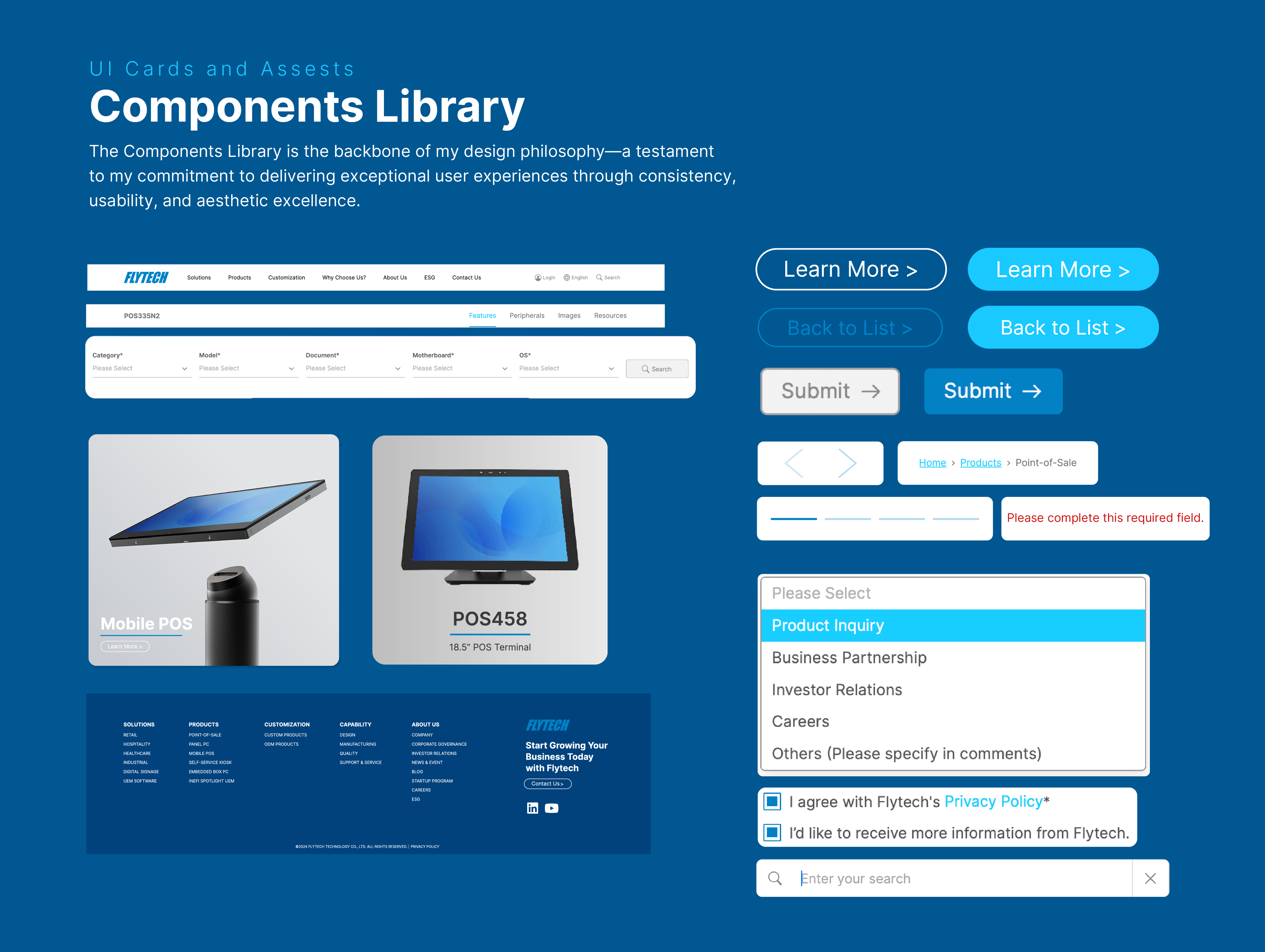
I began with low-fidelity wireframes and a new sitemap, aligning stakeholders around core layouts and page flows.
Early sketches and wireframes explored the product-to-solution relationship.
Through several iterations, I tested navigation patterns that balanced product complexity with clarity.
The new information architecture emphasized:
To validate the redesigned structure and ensure a smooth user experience, I conducted usability testing with eight participants, including existing clients, new users, and internal stakeholders. The interactive Figma prototype was used to observe how participants navigated the site and completed key tasks.
Objectives:
Evaluate how easily users could locate products, access brochures or data sheets, and reach the investor relations and contact pages.
Findings:
Overall, users navigated the new structure with ease and completed tasks significantly faster than before. Most participants appreciated the clear product categorization and direct access to downloadable resources. Some noted that certain buttons and links could be made more visually distinct, especially on mobile.
Actions Taken:
Based on the insights, I improved button contrast, refined spacing for mobile layouts, and added direct brochure download links on product pages. These adjustments streamlined the browsing experience and reduced navigation errors.
Post-test reviews showed improved clarity, faster task completion, and greater overall satisfaction — confirming the redesign effectively addressed key usability pain points.
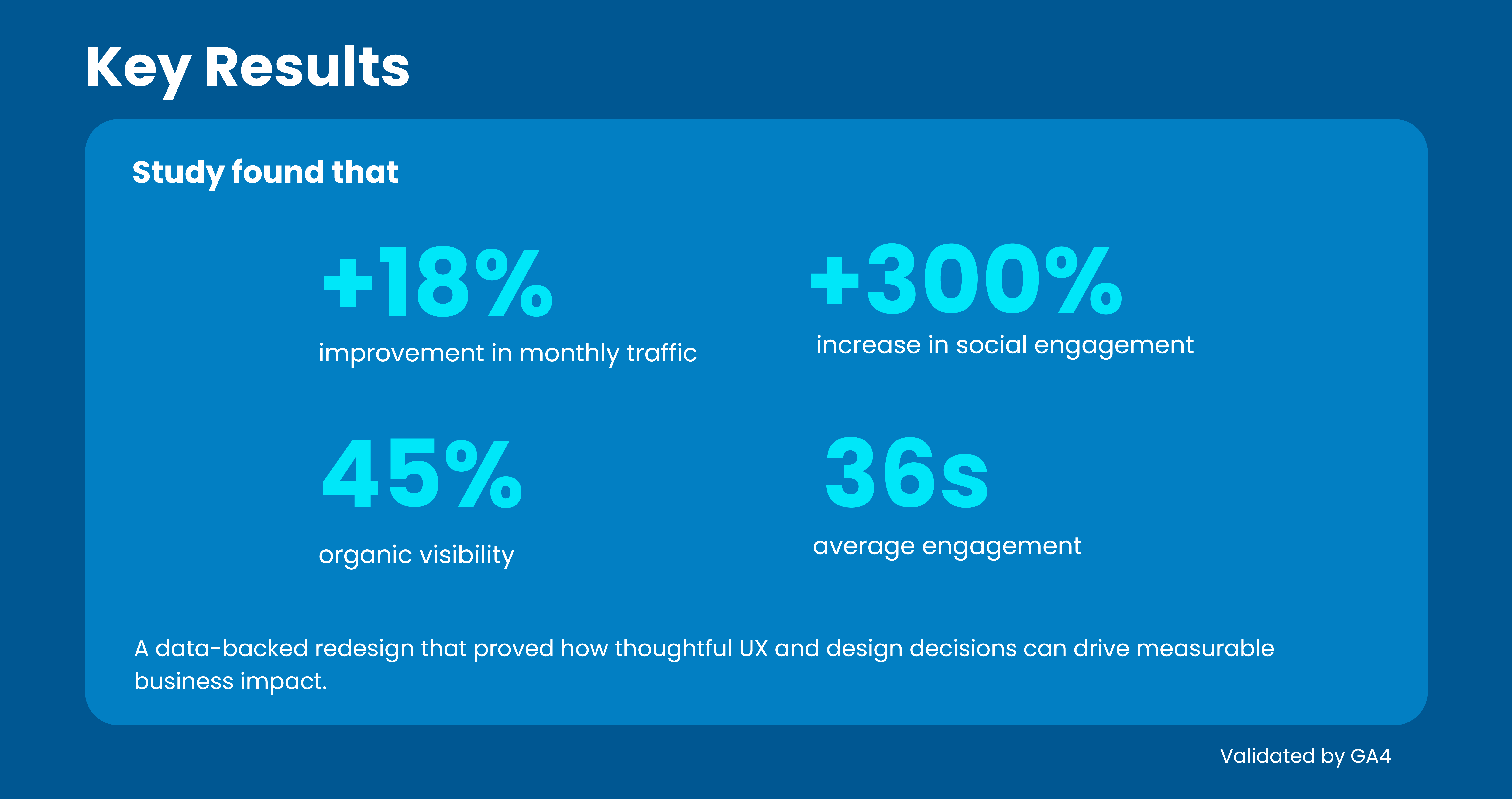
After launch, the redesigned Flytech website achieved measurable success — GA4 data showed an 18% increase in monthly traffic, a 45% boost in organic visibility, and a 300% rise in social engagement. These results validated the effectiveness of a user-centered redesign that balanced business goals with usability improvements.
Through this project, I learned the value of combining data-driven insights with thoughtful design decisions. Collaboration with stakeholders and continuous user testing were key in refining the experience and aligning it with both user and business needs.
The key takeaway: impactful design isn’t just about aesthetics — it’s about creating clarity, trust, and measurable results that strengthen the brand and elevate the user experience.
Update:
After 8 months, Google Analytics showed a clear gap: high Contact page entrances but low form completions. This indicated users were reaching the form yet abandoning before submission.
Insights
The form created unnecessary friction—too many fields, unclear requirements, and no quick wins to keep momentum.
What I changed
Follow-up
Post-launch, I’m tracking form completion rate, time to complete, and drop-off by field to verify uplift and iterate further.
Let’s create something amazing together! Whether you're looking for a designer to bring your vision to life or want to collaborate on a project, I’d love to hear from you. Drop me a message, and let’s make it happen!
