
1. Difficulty Navigating the Museum
Large museums can be confusing, and visitors often struggle to find specific exhibitions or artworks.
2. Overwhelming or Hard-to-Access Information
Artwork descriptions are often long, dense, or displayed far from the artwork, making it difficult to understand the context quickly.
3. Limited Engagement with Exhibits
Traditional museum visits can feel passive. Visitors want more interactive and immersive ways to engage with the art.
4. Accessibility Challenges
Users with visual, hearing, or mobility difficulties often cannot fully access exhibit information or navigate the space comfortably.


Methods
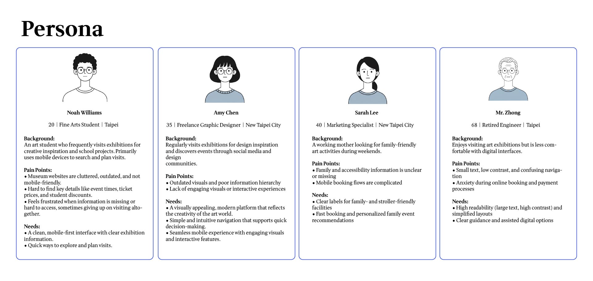
Key Insights
I created low-fidelity wireframes to establish the core structure of the app, focusing on:
These wireframes formed the foundation for the first interactive prototype used in usability testing.
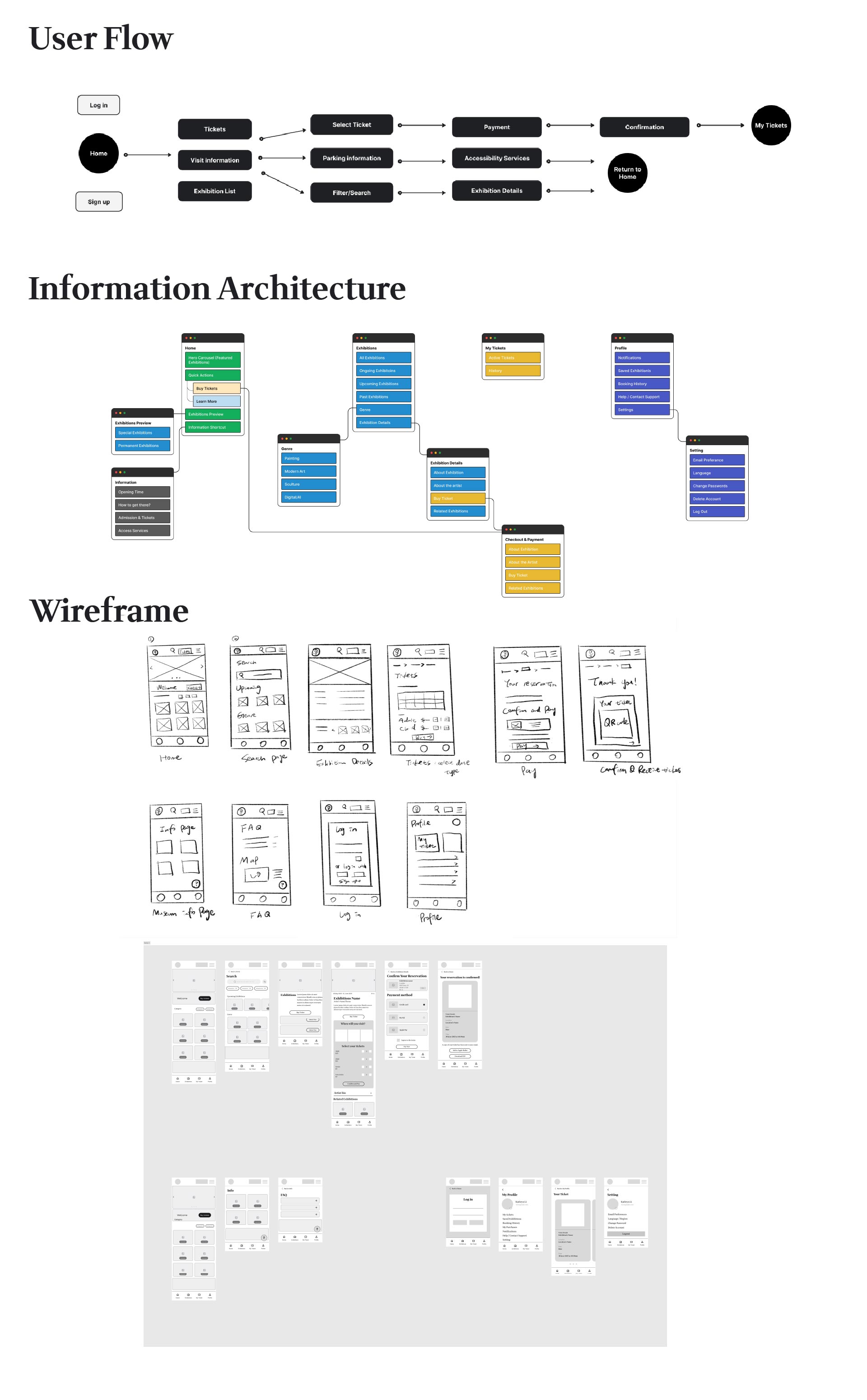
I conducted an unmoderated remote usability test with 5 participants using a high-fidelity Figma prototype.
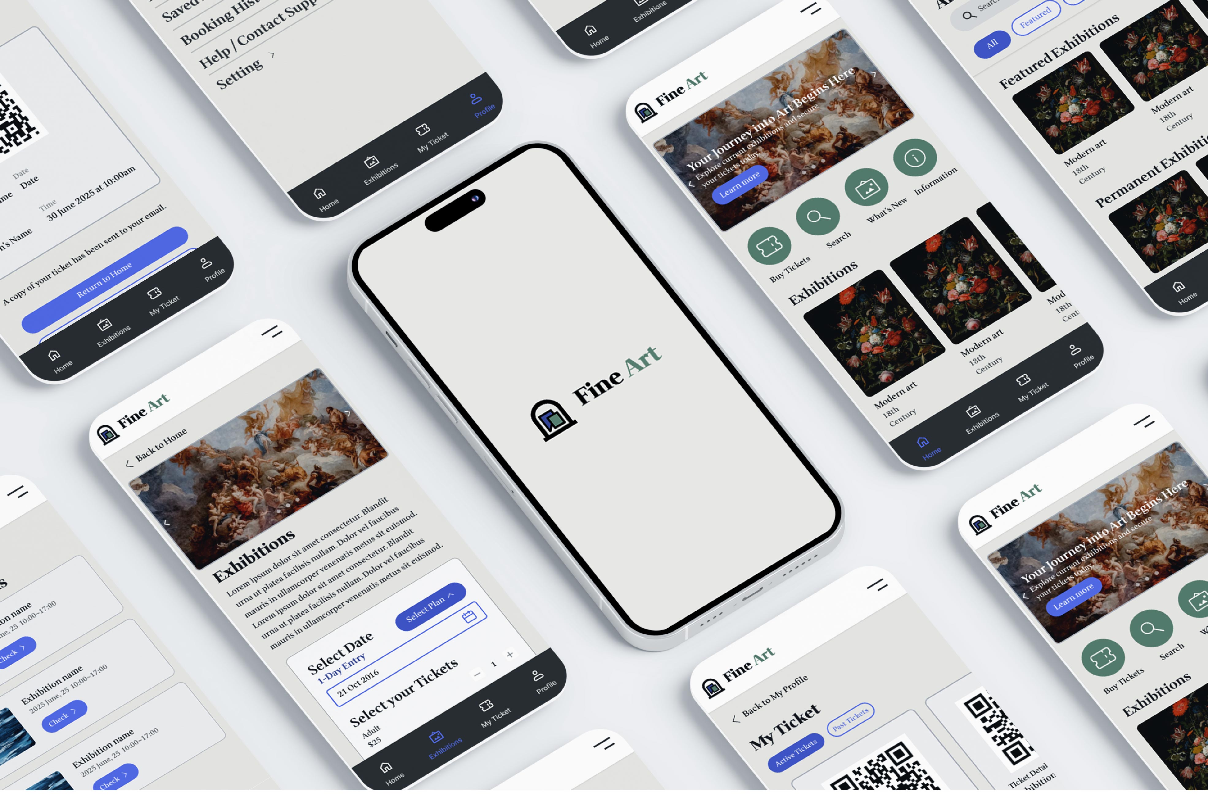
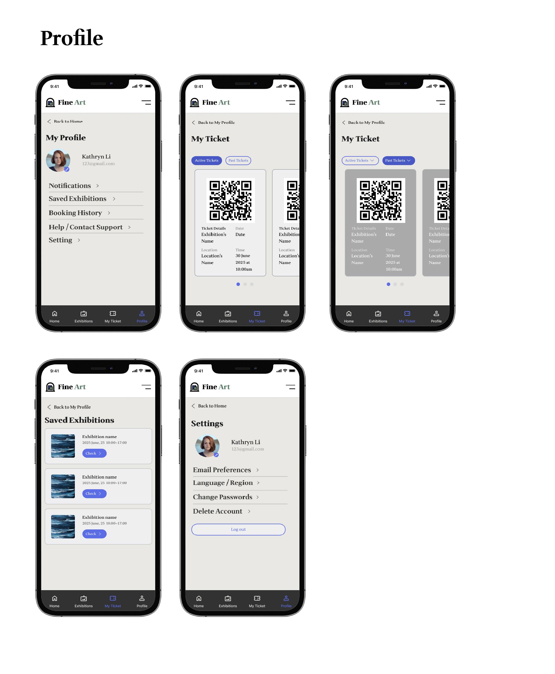
I created a fully interactive prototype to showcase how the app would flow in real life.
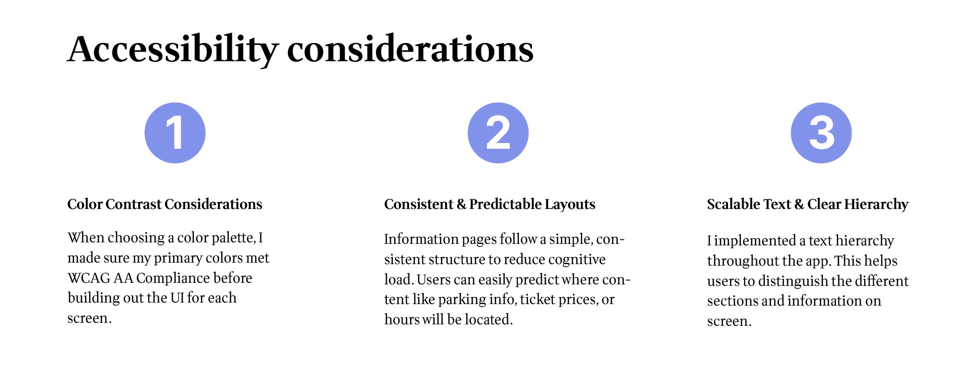
I made sure the design was accessible for all users:
Let’s create something amazing together! Whether you're looking for a designer to bring your vision to life or want to collaborate on a project, I’d love to hear from you. Drop me a message, and let’s make it happen!
