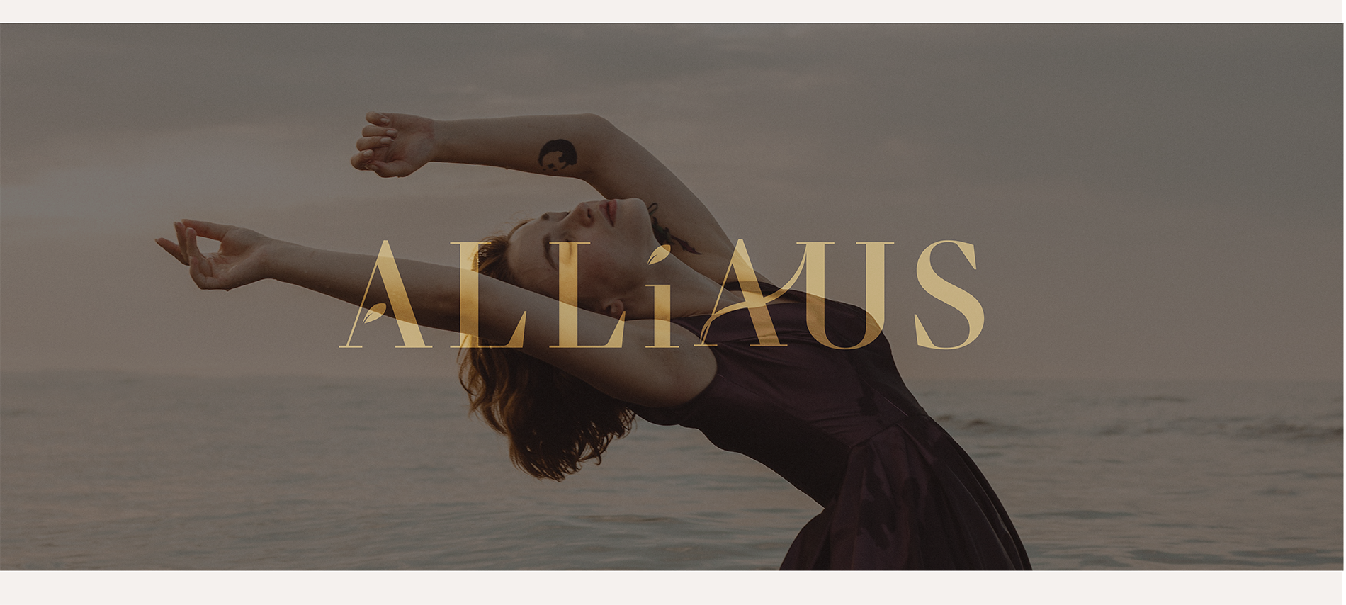
ALLiaus

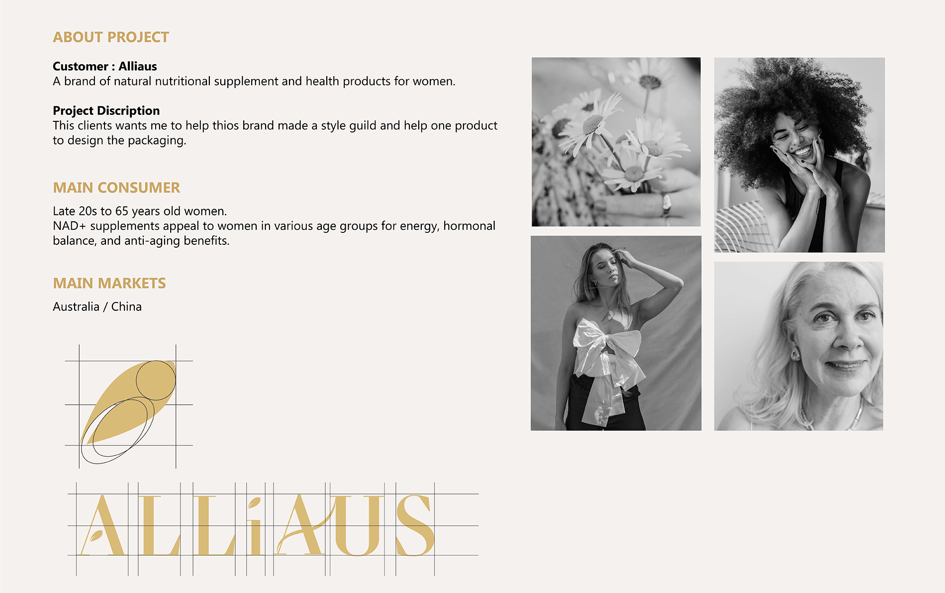
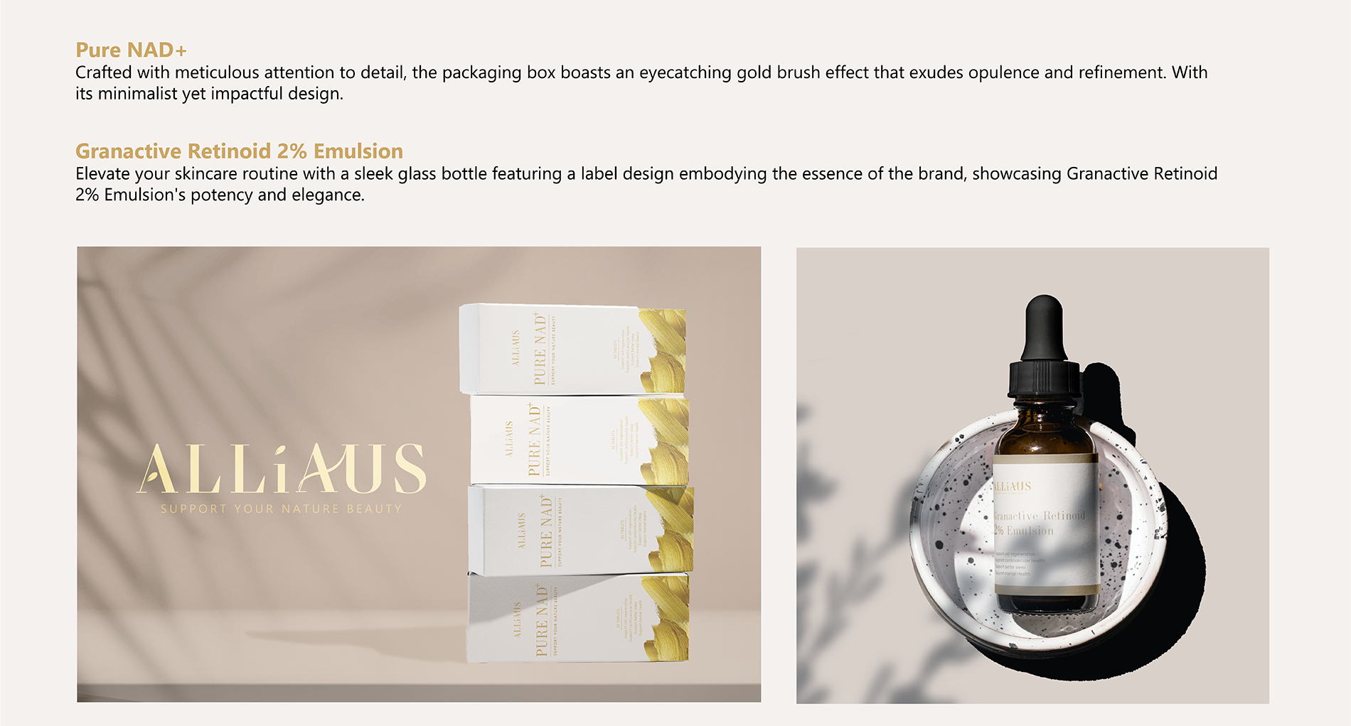
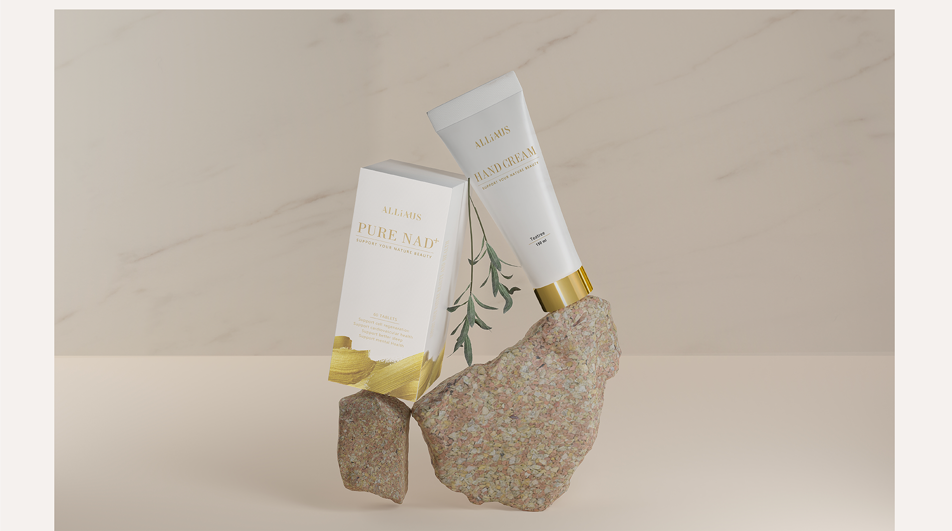
Developed a cohesive brand identity for ALLiAUS, a natural health product brand for women aged late 20s to 65. The project included creating a style guide and designing elegant packaging for NAD+ supplements and facial cream, emphasizing energy, hormonal balance, and anti-aging benefits.
My role: Brand Designer, Graphic Designer
Tools: Illustrator, Photoshop, Keyshot
Design Process
  • Research & Brainstorm
    • Explored NAD+ skincare benefits and target audience needs.
    • Created moodboards that combined scientific elements with warm, inviting imagery.
  • Concept Sketches & Visual Identity
    • Developed logo ideas reflecting the “tech-forward meets gentle care” ethos.
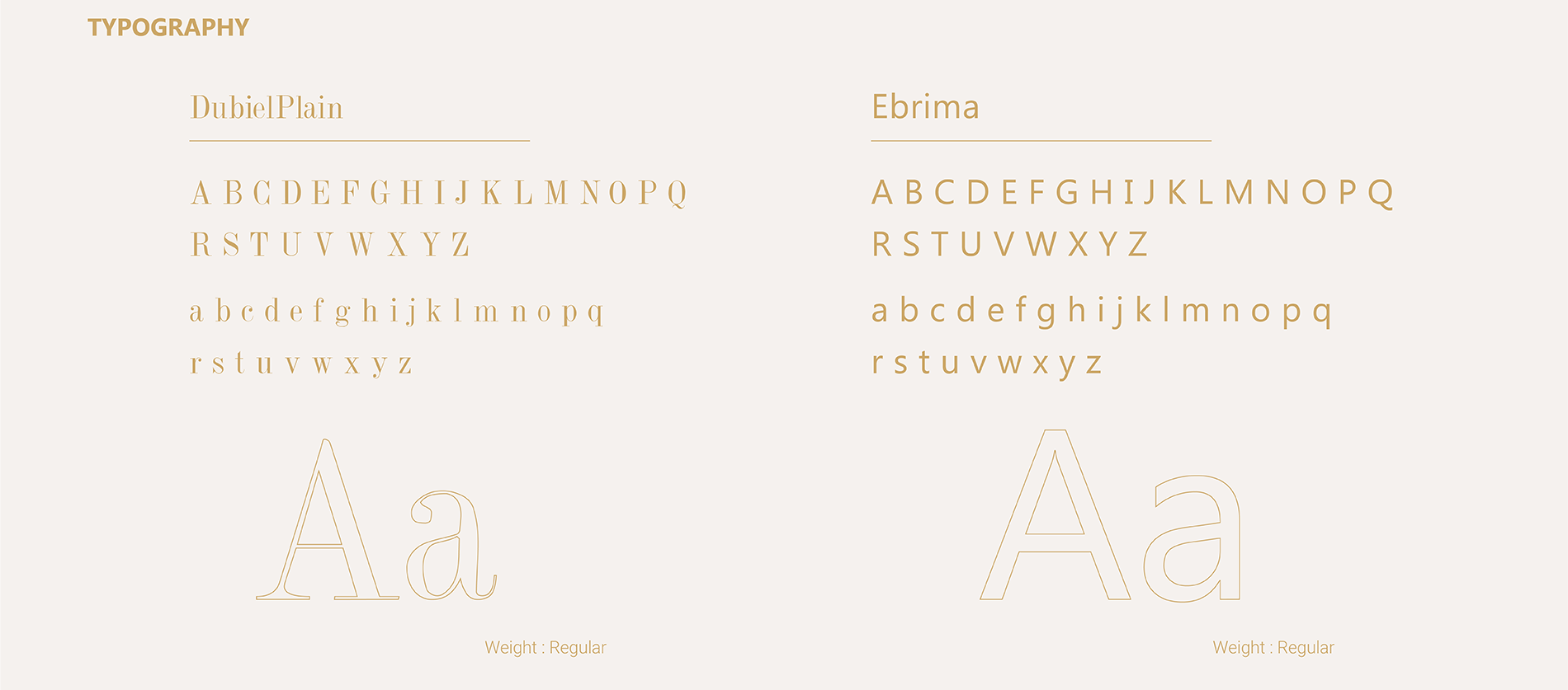
    • Experimented with typefaces and simple geometric shapes referencing molecular structures.
  • Packaging & Collateral Design
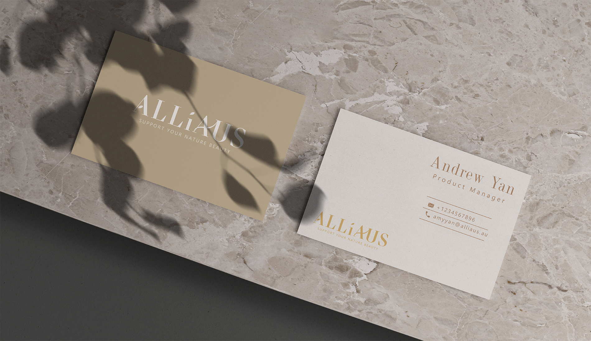
    • Chose subdued color schemes, precise typography, and subtle finishes (metallic/embossing) to convey both luxury and trustworthiness.
    • Ensured product info was clearly visible and elegantly presented.
  • Refinement & Validation
    • Gathered feedback through mock-ups and stakeholder reviews.
    • Adjusted color saturation, typography weight, and layout for clarity and cohesiveness.
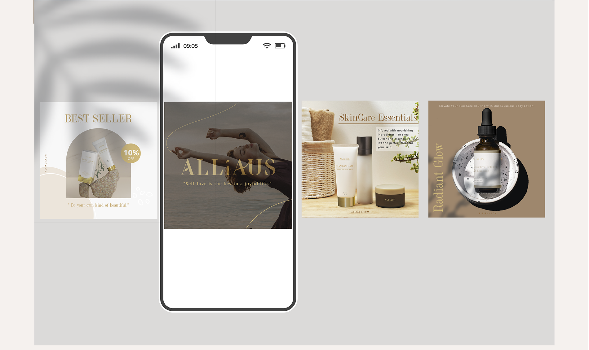
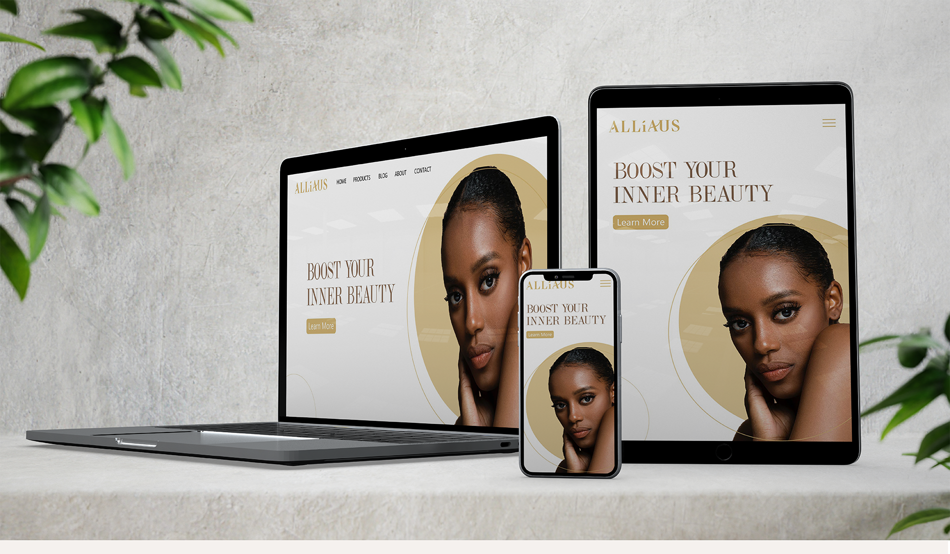
    • Finalized all brand elements for consistency across packaging, marketing, and digital platforms.
  • Discovery & Positioning

    Alliaus’s NAD+ formula required a blend of scientific credibility and a welcoming aura, tailored for women aged 30–60 who prioritize investing in premium skincare for their face and body. We identified “tech-forward meets gentle care” as the brand’s core message.

    No items found.
    Challenge & How I solved it

    Alliaus needed to convey a high-tech skincare breakthrough (NAD+) while still looking warm and inviting—especially for women aged 30–60 who invest in premium self-care. Overly clinical designs could alienate users seeking a gentle, approachable feel, whereas a purely soft aesthetic might underplay the advanced science behind the product.

    I struck a balance by introducing minimal geometric motifs—inspired by NAD+ molecular structures—paired with refined, soft color tones. This approach highlights the brand’s sophisticated edge without losing sight of an intimate, comforting user experience. Careful decisions around metallic finishes, embossing, and delicate accent colors reinforce the cutting-edge formula while keeping the packaging visually inviting.

    No items found.
    Testing & Outcome

    User feedback guided refinements in color saturation, typography weight, and readability. The final identity clearly communicates Alliaus’s modern formula without losing a sense of warmth—instantly conveying the brand’s unique value to its discerning audience seeking effective, high-quality skincare.

    Let's work together !

    Let’s create something amazing together! Whether you're looking for a designer to bring your vision to life or want to collaborate on a project, I’d love to hear from you. Drop me a message, and let’s make it happen!

    Thank you! Your submission has been received!
    Oops! Something went wrong while submitting the form.